

01
The brief
Feel like an architect-led practice rather than a volume housebuilder. Slow craft. Long view.
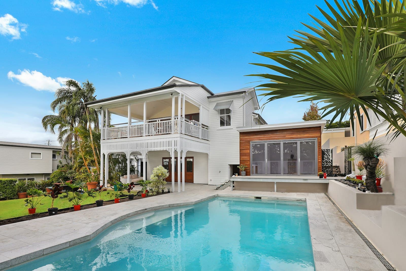
A self-set brief for a small residential developer in the South of England. Most developer sites are sales catalogues with floor-plan PDFs. We wanted to test whether a developer site could carry the same editorial weight as an architecture monograph.
02
What we built
- A philosophy section that justifies the slow numbers.
- A developments list that gives detail without floor-plan PDFs.
- A status tag per development — open, sold out, coming.
- Editorial type pairing — italic display, monospace meta.
03
Status
Concept demo — live preview embedded above. Available as a starting point for a real engagement.